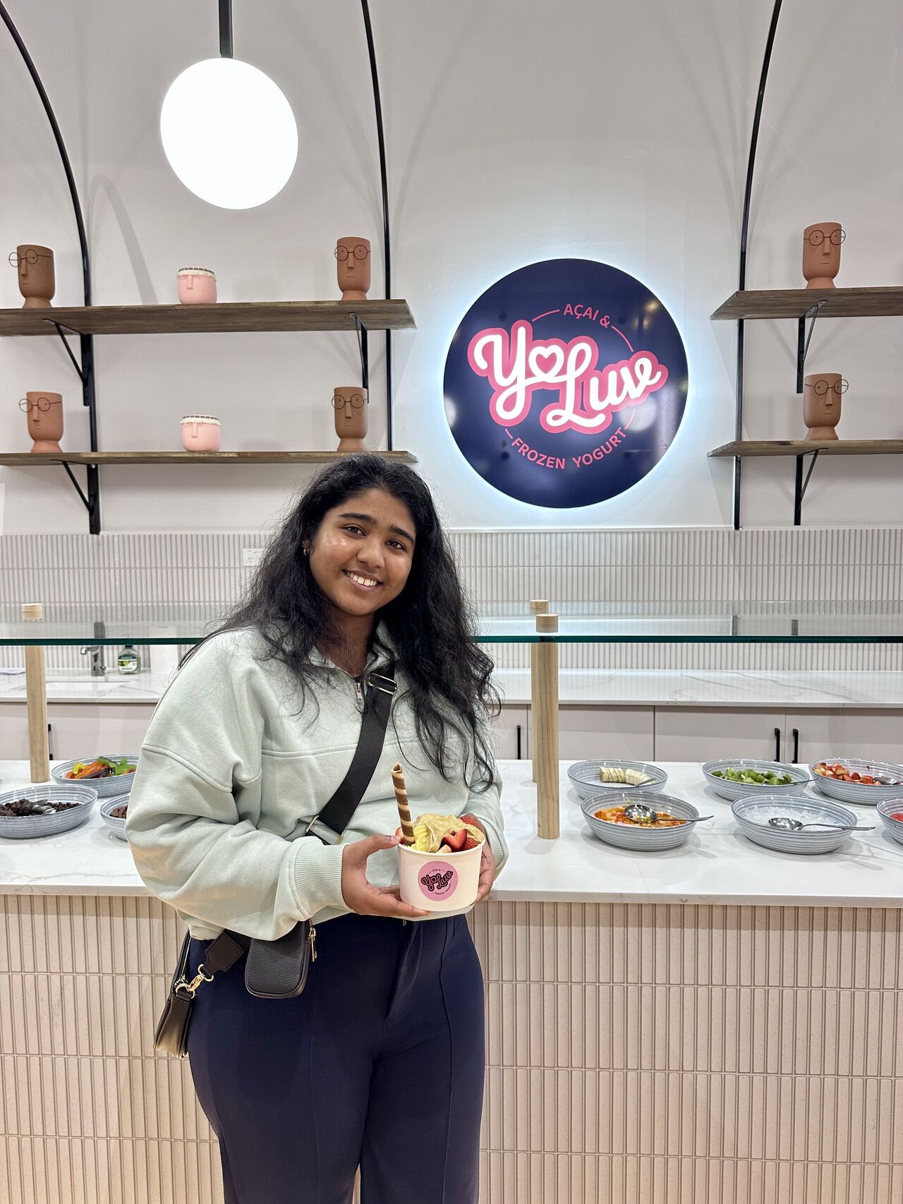
I developed the complete visual identity for Yo-Luv, positioning the frozen yogurt shop as a fresh, modern alternative to generic competitors. The scope covered end-to-end design, translating the brand across custom logo suites, takeaway packaging, retail flavor indicators, and a hero in-store wall mural.
Role
Lead Brand Strategist & Visual Designer
Discipline
Brand Strategy __ Identity Design __ Custom Lettering __ Spatial Mural & Packaging __
Deliverables
Full Brand Identity System | Packaging Suite Retail Mural & Environmental Graphics | Branded Merch
Software Used
Adobe Illustrator (Graphics) Adobe Photoshop (Mockups) Adobe InDesign (Menu & Graphics) Notion (Client Portal)

Brand Strategy & Identity | Merchandise & Mural Design
PROBLEM STATEMENT The frozen yogurt category is flooded with generic, clinical health brands or overly childish store concepts. Yo-Luv needed a ground-up brand strategy and visual identity for its physical retail launch that could highlight its core differentiator, 100% all-natural ingredients, without sacrificing the fun, joyful, and indulgent experience people want from a dessert shop.

TARGET AUDIENCE Families, Young Adults, Health-conscious Indivduals, Dessert Lovers BRAND ESSENCE: Core Values - Joy, Love, Freshness, Creativity Personality - Playful, Friendly, Wholesome Mission - To spread happiness one cup of frozen yogurt at a time


STRATEGIC APPROACH __ Positioned Yo-Luv at the intersection of all-natural freshness and playful indulgence. __ Warm & Tactile: Built the identity around organic shapes and friendly cues to make the store feel welcoming rather than sterile. __ High-Energy Contrast: Used bold, fruit-inspired contrast to signal vibrant flavor and cheerful energy at a glance. __ Human Touch: Chose soft, rounded letterforms and hand-drawn accents to keep the brand personal and avoid corporate stiffness.


CREATIVE DIRECTION Clean and contemporary, dialed in with pure, high-spirited energy. Visual Hook : Bold contrasts between deep, refreshing blues and vibrant berry pinks to evoke cold, fresh fruit. Style : Simple, confident shapes mixed with dynamic graphic elements to create visual movement. Typography : Expressive script accents paired with clean, rounded type for instant personality without sacrificing legibility.

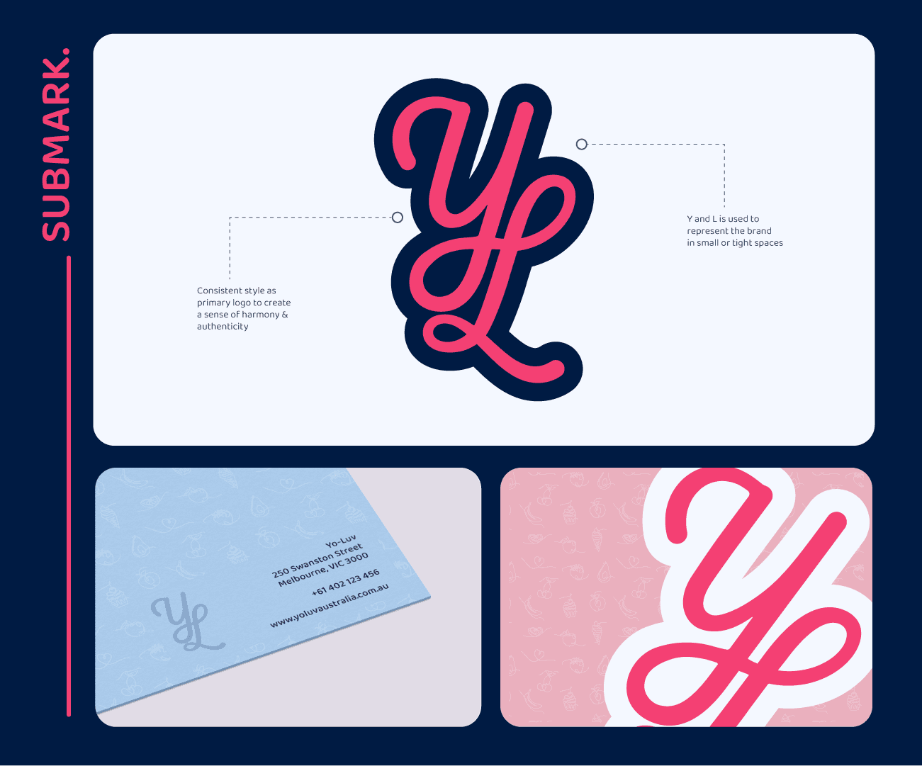
LOGO VARIATIONS The logo suite includes a primary script wordmark with an integrated negative-space heart, a vertically stacked secondary badge for tight circular placements, and an interlocking YL submark for micro-scale touchpoints like loyalty stamps and a favicon.

Fonts & Color Palette: A hand-drawn script adds personal warmth, balanced by a rounded sans-serif for effortless legibility. Refreshing blues pair with punchy berry pinks to instantly evoke cold yogurt and fresh fruit across physical packaging and digital menus.

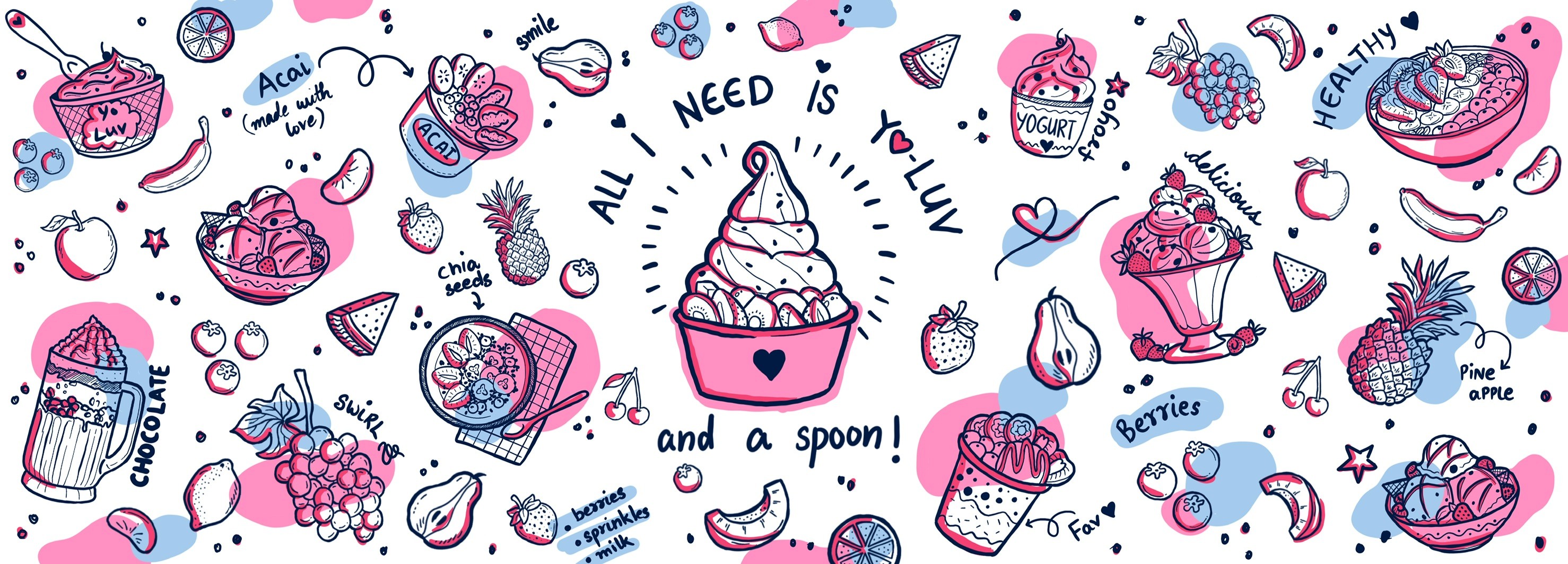
Illustrations & Patters: Custom line-art illustrations and repeating patterns add texture, personality, and motion across cups, bags, and digital screens. Designed modularly, these assets keep packaging cohesive, instantly recognizable, and fun to hold.
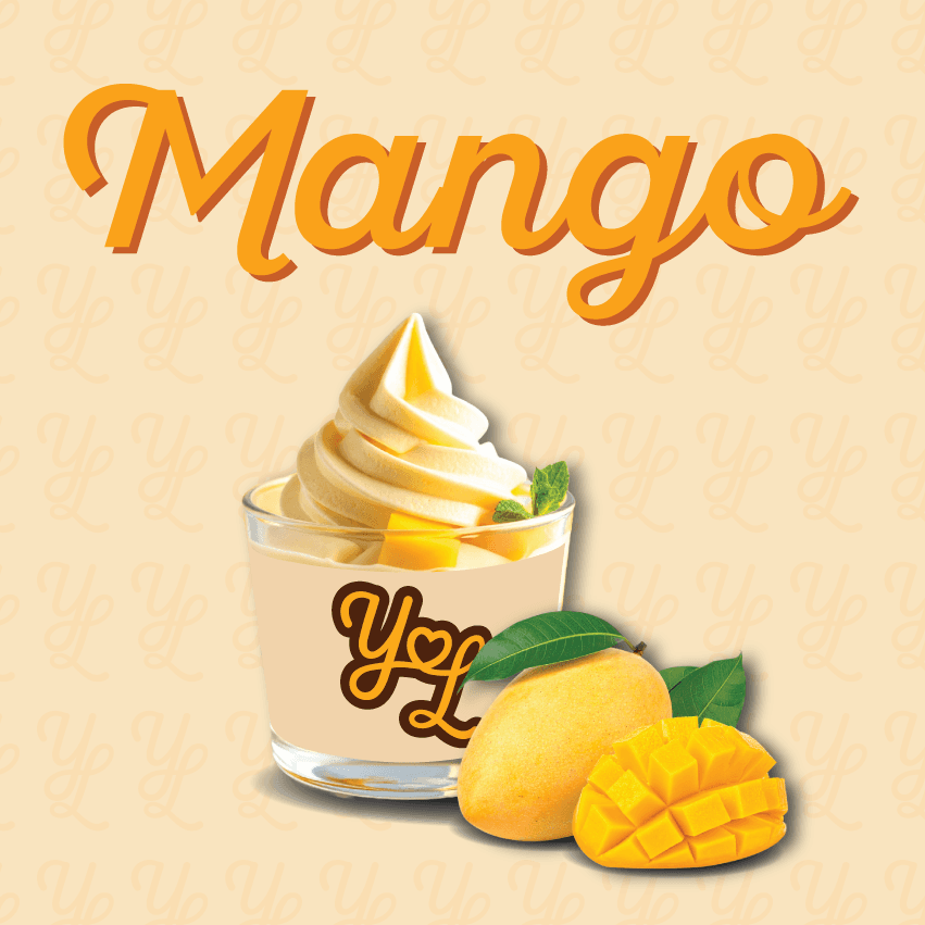
Flavour Indicators & Wall Murals: Custom flavor badges make navigation fast and intuitive at the self-serve counter. Across the main wall, a bold hero mural - "All I need is Yo-Luv and a spoon!", turns the physical shop into an inviting, photo-worthy customer experience.


MY ROLE __ Strategy & Identity: Led positioning from scratch, designing the full responsive logo suite, color palette, and bespoke pattern library. __ Physical Touchpoints: Translated the brand into the real world across takeaway packaging, uniform merch, and custom signage. __ Spatial Design: Directed the in-store visual experience, designing self-serve flavor indicators and the hero environmental wall mural.
KEY IMPACT & OUTCOMES __ Immediate Market Differentiation: Positioned Yo-Luv clearly against generic froyo chains with a warm, modern aesthetic that drove organic customer foot traffic from day one. __ Streamlined In-Store Flow: Intuitive flavor indicators sped up the ordering and self-serve process during peak retail hours. __ Organic Reach: The unique branding, mural and tagline became a primary attraction, generating consistent customer-led social shares across Instagram and TikTok. __ Scalable Production: Standardized packaging templates and asset guidelines allowed the business to reorder inventory and roll out new seasonal flavors without additional design overhead.